Colour is one of the first things people notice when looking at a garment. It can influence how an outfit appears, how different pieces work together and how a fashion collection communicates its identity. For designers, choosing colours involves more than personal preference. It requires an understanding of colour relationships, fabric properties and the purpose of the clothing.
Fashion colour theory provides a useful foundation for making these decisions. By learning how colours interact, aspiring designers can create coordinated outfits, develop distinctive collections and communicate their creative ideas more effectively.
What Is Colour Theory in Fashion Design?
In fashion design, colour theory helps designers understand how different shades work together to create a particular look or mood. In fashion design, it helps designers select shades that complement each other and support the intended appearance of a garment.
A designer creating everyday clothing may prefer subtle combinations, while someone developing festive wear might experiment with richer shades and stronger contrasts. Neither approach is universally better. The choice depends on the design concept, intended audience and occasion.
Understanding colour relationships gives designers a starting point for experimenting with combinations rather than selecting shades randomly.
Understanding the Colour Wheel
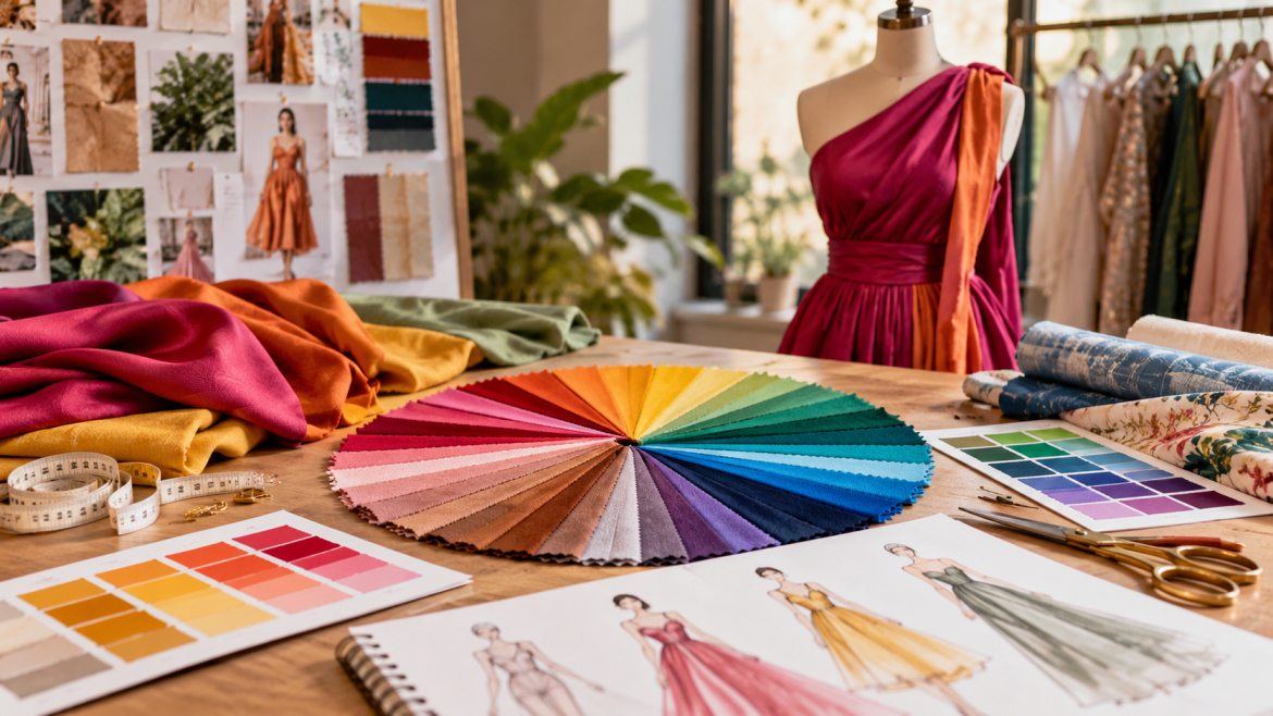
A circular colour guide helps fashion designers see how different shades relate to one another and choose suitable combinations for their designs. It can help beginners understand which shades may work well together.
Primary colours are traditionally identified as red, yellow and blue in the basic artist’s colour model. Secondary colours are created by combining pairs of primary colours, while tertiary colours result from mixing a primary colour with a neighbouring secondary colour.
Although textile dyes, pigments and digital displays can behave differently, the colour wheel remains a useful introductory guide for fashion students.
Popular Colour Combinations Used in Clothing
1. Monochromatic Colour Combinations
A monochromatic combination uses different shades, tints or tones of one colour. For example, an outfit may combine light blue, medium blue and deep navy.
This approach creates visual continuity while allowing designers to introduce variation through fabric texture, garment shape and detailing. It can work well for formal clothing, coordinated sets and minimalist collections.
2. Complementary Colours
On the colour wheel, complementary shades create contrast because they are positioned across from one another. Blue with orange and red with green are common examples of these pairings.
These combinations can create strong visual contrast. Designers may use one colour as the dominant shade and introduce its complement through smaller details, accessories or selected garment panels.
The balance between the two colours matters. Using both at equal intensity across a large garment may produce a much stronger effect than intended.
3. Analogous Colours
Analogous colour schemes bring together shades that share a similar position on the colour wheel, such as blue, blue-green and green. Combinations such as blue, blue-green and green can produce a connected appearance.
This method is useful when a designer wants several colours within one outfit or collection without creating excessive contrast. It can also help establish a consistent visual direction across multiple garments.
4. Neutral Colour Combinations
Neutral shades such as black, white, grey, beige and brown are frequently used in clothing design. They can form the main palette or balance brighter colours.
For instance, a beige outfit with a deep blue accessory may feel different from an outfit that uses blue across most of its surface. Neutral shades can also help create versatile garments that coordinate with a wider range of clothing.
Warm and Cool Colours in Fashion
Colours are often described as warm or cool according to their visual associations.
Warm colours include shades such as red, orange and yellow. They can create a lively or energetic impression, depending on their intensity and context.
Cool colours include blue, green and violet. They may be used to develop calm, fresh or understated visual themes.
These descriptions are general design conventions rather than fixed emotional rules. The effect of a colour can change with cultural context, surrounding shades, lighting and individual preferences.
Fashion designers can experiment with warm and cool combinations to establish contrast or create a balanced palette.
How Fabric Influences Colour Appearance
Different materials can display the same shade in different ways because of their texture, finish and ability to reflect light. Material texture, weave, surface finish and light reflection can change the way a shade appears.
A smooth fabric may reflect light differently from a textured material. Matte surfaces can produce a softer appearance, while glossy fabrics may make colours look more intense under certain lighting conditions.
Designers should therefore examine actual fabric samples whenever possible. Viewing materials under different lighting conditions can also help identify unwanted differences before a garment is produced.
When working with multiple fabrics in one outfit, comparing their colours together is more reliable than choosing each material separately.
Choosing Colours for Different Fashion Projects
The intended use of a garment can influence the colour selection process.
Everyday clothing: Designers may choose versatile colours that coordinate easily with other wardrobe pieces.
Festive wear: Rich shades, metallic details and contrasting combinations may suit the intended design, depending on cultural preferences and the occasion.
Professional clothing: Neutral palettes and carefully selected accent colours can create a coordinated appearance.
Children’s clothing: Bright shades, soft pastels or playful combinations may be appropriate depending on the collection’s theme and audience.
Fashion collections: Designers can give a collection a unified look by selecting related shades while adding individual colour details to distinguish each outfit.
These suggestions can guide colour selection, but the final choice should depend on the design, fabric and intended audience. Designers should consider customer preferences, material availability and the purpose of each collection before making final decisions.
Common Colour Selection Mistakes to Avoid
Choosing colours can be challenging when several shades appear attractive individually but do not work well together.
Some common mistakes include:
- Selecting too many competing colours without a clear design direction.
- Ignoring the effect of fabric texture and surface finish.
- Choosing colours on a screen without checking the actual materials.
- Using strong contrasts in every part of a garment.
- Following trends without considering the intended customer.
- Failing to maintain consistency across a coordinated collection.
Creating a small colour palette before beginning garment development can help prevent these problems. Designers can test the selected shades using fabric swatches, sketches or digital mood boards.
How Fashion Students Can Practise Colour Theory
One practical exercise is to select a single colour and create several combinations around it. Students can experiment with monochromatic shades, complementary colours and neutral accents to see how each approach changes the appearance of a design.
Another useful activity is to develop a colour palette for a small clothing collection. The palette should reflect a clear theme and work across several garments without making every piece look identical.
Comparing fabric swatches, observing colours in different lighting and reviewing finished outfits can gradually improve colour selection skills.
Skill Haara offers fashion-related learning opportunities, including its Master Diploma in Fashion Entrepreneurship and Boutique Management with Sewing Machine program. Learners interested in developing their knowledge of clothing design and garment-making techniques can explore the course details to determine whether the program suits their goals.
Students exploring a fashion designing course in Trivandrum can also review Skill Haara’s available programs to find training that matches their interests.
Conclusion
Colour theory helps fashion designers make more informed decisions when selecting shades for garments and collections. Understanding the colour wheel, warm and cool colours, complementary combinations and fabric characteristics can provide a practical foundation for creative work.
By testing colour palettes and observing how different materials respond to light, aspiring designers can develop a clearer sense of visual coordination. With continued practice, colour selection becomes a useful part of the wider process of planning and creating clothing.